UI 6 Quick Panel Design: Samsung nailed it!
Today, Samsung spilled its plans of launching One UI 6 beta (Android 14) before it could make it official but we got our eyes locked on the redesigned quick panel, which is looking fantastic.
Let’s take a look at the latest
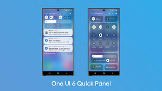
The first swipe reveals the latest changes in the notifications, these are subtle and categorize priority-wise notifications from different apps.
Above that you will find the inclusion of a new brightness controller slider. The icon highlights are also changed to white, which may be due to the enhanced system-wide material you adapt. Also, the time and date on the top left are aligned together.
Full revelation: including tiles view – top bar inline
The real magic happens in the fully expanded view of the quick panel with new design changes. The top side looks clean and the icons in the status bar look bigger than One UI 5.1 or below.
The entire section of quick settings is now comprised of different sections. On the top side, you will find connectivity tiles for WiFi and Bluetooth. Followed by a large section for quick settings icons. The entire appearance looks subtle and better.
Next up are the brightness slider and eye care controls. And there are two tiles at the bottom for Smart View and Device control. Overall, the look is pretty neat and seemingly achieves the goal to provide high visibility.
Changes in color and background effects are also eye-catching and the restructuring of the entire quick settings panel deserves an A+ mark.
From the looks, you can definitely say that the One UI 6 quick panel feature will give you a new user experience. However, it’s just a glimpse of the entire One UI 6 capabilities and there’s more to know when its beta opens in public.


Comments
Post a Comment
I like any one commed and see my post in the website